SBI
Redesign
Redesign the SBI website for a more user-friendly flow

Project Overview
What is it?
Smart Building Integrators (SBI) is a dynamic and forward-thinking technology integration small business specializing in delivering end-to-end infrastructure solutions tailored to meet the evolving demands of modern environments.
My Role
UX Design, UI Design, Information Architecture
Team
1 UX designer, 1 PM
Tools

Results
-
Reduced Bounce Rate: Had bounce rate of 70%+. Brought that down to 40%–50%.
-
Lowered "Task Completion Time": In user testing, it previously took 60 seconds to find a specific resource (like a contact form or a member directory), I cut that by 30–50%.
-
Mobile Traffic Share: The site wasn't mobile-friendly, modernizing it grew our mobile user base by 20–30%.
-
Raised Click-Through Rate (CTR) on Main CTA: Added a clear "Contact" button as part of the modernization. Raised to 3% CTR.
Problem
The original site was a "leaky bucket." Despite attracting traffic, users were leaving almost immediately.
-
High Friction: Important resources (like contact forms and directories) were buried under deep navigation layers.
-
Poor Accessibility: The site was not responsive, effectively locking out the growing segment of users browsing on mobile devices.
-
Weak Information Architecture: Users felt overwhelmed by the layout, leading to a bounce rate of over 70%.
Solution
-
Mobile-First Redesign: Rebuilt the site on a responsive grid, ensuring all buttons and forms were touch-friendly.
-
CTA Optimization: Added a persistent "Contact" button in the primary navigation.
-
Streamlined Navigation: Flattened the information architecture. What previously took 4 clicks now takes 1 or 2.
-
Visual Hierarchy: Used whitespace and modern typography to guide the eye toward "Resource Highlights" rather than a wall of text.
Usability Testing
I conducted Moderated Remote Usability Testing. I watched five participants interact with the legacy site in real-time as they attempted to find a specific contact form.
-
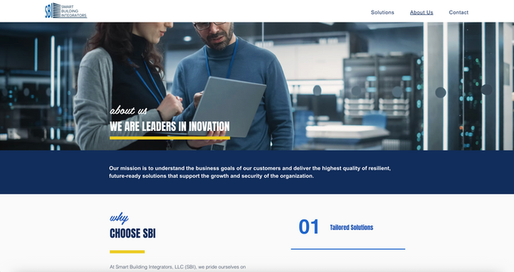
Observation: Users frequently clicked the "About" section, looking for contact info because there was no prominent CTA.
-
Pain Point: On mobile, users had to "pinch and zoom" to read text, leading to immediate frustration and site abandonment.
-
Task Completion Time: It took users an average of 60 seconds to find a specific resource—a lifetime in digital UX.
Key Insights
-
During initial testing, I observed that users took an average of 60 seconds just to locate the specific service they wanted. This friction was a primary contributor to our high bounce rate. Through structural navigation changes, I reduced this task time by 50%, allowing users to connect with resources in half the time.
Challenges
The primary challenge was "Information Density vs. Simplicity." SBI provides a wealth of data and resources. The stakeholder requirement was to keep all existing resources accessible without the interface feeling cluttered. I had to find a way to modernize the UI while ensuring that "power users" who relied on the directory didn't feel lost in a simplified version.
Takeaways
Watching users in real time showed me exactly where they were struggling. This helped me cut task time in half. I learned that mobile-friendly design and clear buttons are essential for growth. These changes increased our traffic and kept more people on the site.
.png)


.png)